You’ve got the story down and the characters begging for faces, but how do you pick an illustration style that makes readers fall in love? Let’s break down the vibe, the audience, and the practical steps so you end up with visuals that elevate your book—not distract from it.
First, Nail the Audience and the Mood

Choosing an illustration style starts with who you’re talking to. Picture your reader: age, attention span, and what they’re drawn to emotionally. A preschool book might crave bold shapes and bright colors, while a middle-grade tale can handle more nuance and detail. Ask yourself these questions early:
- What age range is this for?
- What feeling should the art evoke—whimsy, cozy, adventurous, magical?
- How will the illustrations support the storytelling (pacing, emotion, theme)?
Match Style to Themes and Tone
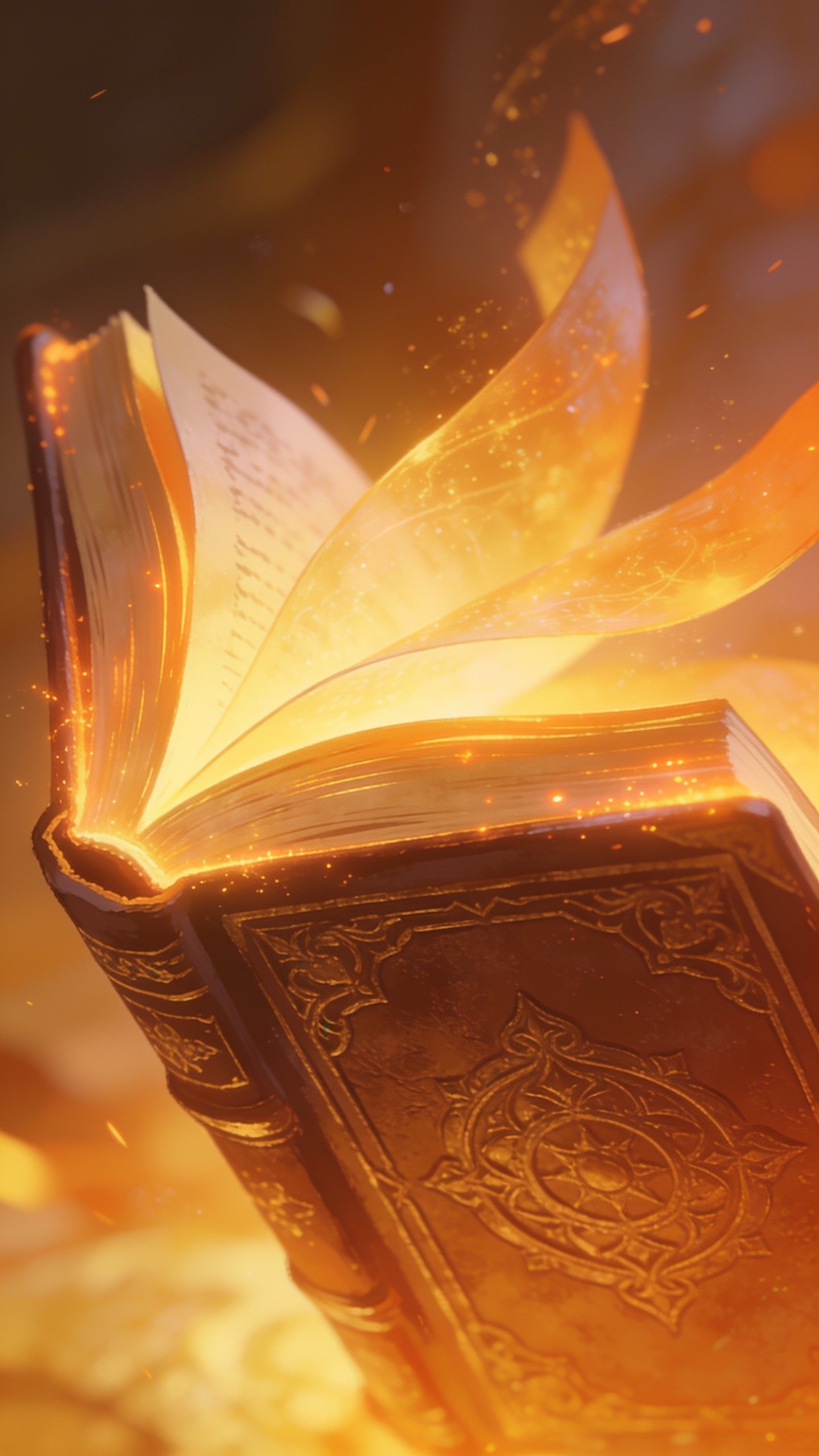
Your book’s themes should guide the visual language. If your story leans into curiosity and discovery, you might lean toward playful, exploratory lines. If it’s a tender, emotional slice-of-life, softer textures and warmer palettes can do the heavy lifting. Consistency is your friend—a unified look helps kids recognize characters and stay immersed.
Palette and Personality: Color Matters

Color isn’t just pretty—it communicates mood and can influence reading pace. Bright primaries grab attention for younger audiences; cooler, muted tones can calm a scene or signal mystery. Consider:
- Primary colors for action-packed chapters
- Pastels for gentle moments
- High-contrast combos for early readers
Think about accessibility too: ensure there’s enough contrast for readability, and avoid color combos that could be confusing for color-blind readers.
Character Design: Consistency Over Craziness

Kids connect with memorable characters, so give them a recognizable silhouette and consistent features. Decide on:
- How many characters will appear regularly?
- Do you want exaggerated features for expressiveness or more realistic proportions?
- Will the characters’ outfits reflect the setting and culture respectfully?
Strong character design anchors the book and makes it easier for kids to follow the story across pages.
Illustration Styles to Consider (and When They Shine)

Here’s a quick tour of common styles and the vibes they bring. Use this as a mental checklist to see what aligns with your story.
Bright, Bold, Cartoonish
– Great for early readers and humor-heavy stories.
– Quick recognizability on crowded shelves.
– Pros: High energy, clear facial expressions.
– Cons: Can feel generic if not tailored.
Soft, Watercolor-Inspired
– Perfect for cozy, emotional, or nature-centered tales.
– Pros: Gentle, inviting atmosphere; great for mood.
– Cons: Printing costs and color reproduction can be tricky.
Minimalist, Graphic
– Clean lines, lots of white space. Reads very clearly on small devices too.
– Pros: Modern, stylish; scalable for different formats.
– Cons: Needs strong typography and layout to carry the story.
Vintage or Retro
– Nostalgic appeal that can attract parents and kids alike.
– Pros: Distinct personality; versatile for historical or timeless themes.
– Cons: Risk of feeling dated if not executed thoughtfully.
Documentary/Photographic
– Realistic or collage-based visuals for nonfiction or realism-heavy fiction.
– Pros: Authentic feel; great for world-building.
– Cons: May clash with more whimsical narratives.
Scale, Medium, and Printing Realities
Practical constraints can steer your style choice. Ask your publisher (or printer) about:
- Color limitations and proofs
- Bleed, margins, and page counts
- Digital vs. print fidelity and texture rendering
Some styles look gorgeous on screen but fall flat in print if you don’t plan for ink and paper texture. FYI: test prints are your best friends here.
How to Collaborate with an Illustrator (Without Losing Your Vision)
Collaborations thrive on clear, early alignment.
- Share a visual brief with mood boards, color palettes, and example pages.
- Provide scene-by-scene notes on tone and character expressions.
- Agree on a process for approvals and revisions to avoid scope creep.
Bringing Your Book to Life: A Practical Step-by-Step
- Define your core audience and emotional goal for the visuals.
- Choose 2–3 potential illustration styles that fit your tone.
- Commission or select an illustrator whose portfolio aligns with your goals.
- Develop a simple art bible: color palette, character sheets, and environmental cues.
- Review in phases: thumbnails, roughs, color studies, final art.
- Test with kids or parents to gather feedback before finalizing.
Where Your Style Meets Your Story: Real-Life Examples
Sometimes the best way to decide is to see it in action. Consider:
- A playful board book that uses bold shapes and high-contrast colors to support early readers.
- A whimsical fantasy where watercolor washes create dreamlike spaces that match magical moments.
- A nonfiction title about animals with clean, diagram-like illustrations that simplify complex info.
FAQ: Your Most Pressing Questions About Illustration Styles
What illustration style is best for a beginner reader’s book?
Bold, high-contrast, simplified shapes work wonders. Clear character silhouettes and minimal clutter help new readers decode visuals quickly.
How do I ensure the art matches the book’s tone?
Create a concise art bible that outlines mood, palette, line weight, and facial expressions for key moments. Share it with your illustrator at the start and reference it often.
Can I mix styles within one book?
Yes, but do it intentionally. A gentle transition—like a chapter header illustration in one style and interior art in another—can signify shifts in perspective or time, as long as the core mood stays cohesive.
How important is color for younger readers?
Color is huge. It draws attention, signals action, and can convey emotion. Strong contrast helps readability, especially for early readers or kids with visual processing differences.
What if I’m worried about cultural accuracy in character design?
Do your homework and involve sensitivity consultants or diverse beta readers. Provide multiple reference boards and steer away from stereotypes. Respectful representation matters.
Conclusion: Your Book Deserves a Style That Slays
Choosing the right illustration style isn’t just about looking cute on the page. It’s about amplifying your story, supporting pacing, and helping readers connect with every character. Take the time to align mood, audience, and practical constraints, then partner with an illustrator who shares your vision. The result should feel effortless, cohesive, and totally irresistible to both kids and grown-ups who pick up your book. IMO, the right visuals can turn a good story into a book that kids beg to reread and parents actually want to read aloud again. FYI, trust your instincts, test early, and let the art breathe with the narrative.