These ideas are designed to spark curiosity, color curiosity, and get little hands grabbing a new story. Let’s dive into playful, kid-friendly cover concepts that scream, “Open me!”
1. Playful Characters in Action

Kids love seeing a moment they can imagine themselves stepping into. A dynamic pose or cheeky expression invites questions like, “Who is that?” and “What are they doing?”
Key elements:
- Bold, expressive faces
- Clear silhouette for quick recognition
- Bright, contrasting colors
When to use: Great for adventures, mischief, or friendship tales. This approach helps little readers feel instantly connected with the characters.
2. Big, Central Object with Surprising Details

Center a large object that hints at the story’s magic or mystery. The details around it invite closer inspection—perfect for re-reading and discovering new clues each time.
Why it works: It creates a focal point while rewarding curious kids with tiny, hidden surprises.
Tips:
- Choose a single hero object (a hat, a telescope, a kite)
- Fill the background with small silhouettes or textures
- Use a complementary color palette to pop the center
Benefits: Encourages kids to explore the cover and guess the plot before opening the book.
3. Whimsical Landscape That Feels Like a Doorway
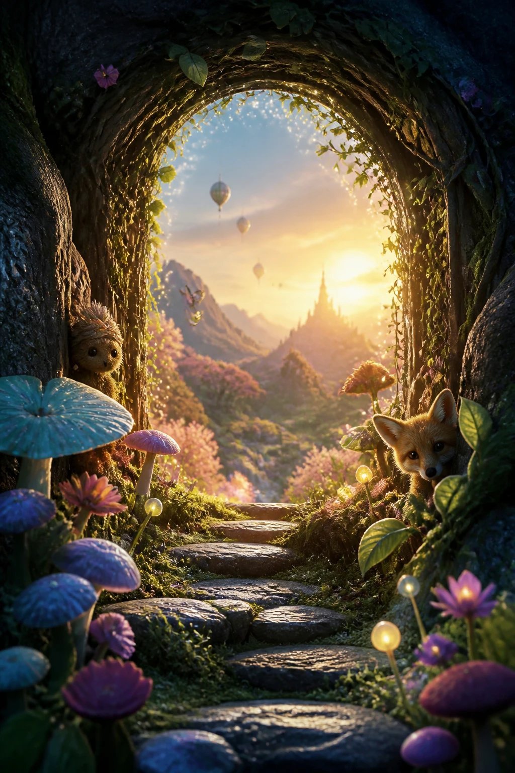
Imagine a cover that looks like a sparkly window into another world. A sweeping landscape with quirky flora and floating elements invites kids to step into the story, not just skim it.
What to include:
- Curious creatures peeking from the edges
- Layered foreground, midground, and background
- Subtle texturing for depth
End note: This approach works well for fantasy and nature-rich tales. It’s like a promise that adventure awaits beyond the pages.
4. Hidden Message or Puzzle Motifs
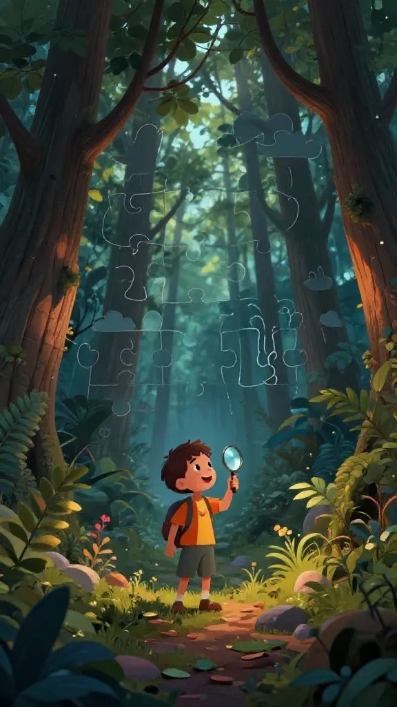
Incorporate a simple puzzle, riddle, or hidden shapes woven into the illustration. It turns the cover into an interactive teaser kids can discuss with grown-ups.
How to do it:
- Hidden shapes in trees, clouds, or patterns
- Spell out a word or clue with letter cues
- Color grouping that hints at the story’s mood
Pros: Encourages curiosity and revisits the cover to spot new clues. It feels like a mini-game before the first page turns.
5. Mischief-Milled Typography and Scene
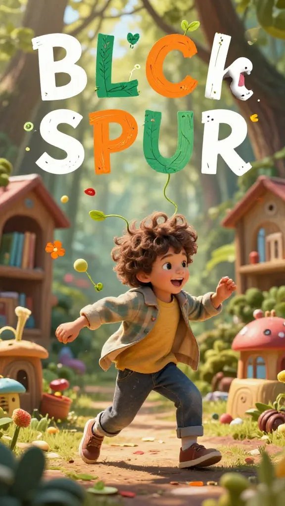
Blend the cover art with typography that feels alive. Letters that wobble, twist, or sprout from the scene create a playful, dynamic vibe.
Why it shines:
- Typography interacts with imagery
- Bold, readable title that remains visually integrated
- Colorful type that matches the color palette
Tip: Keep the title legible from a distance, especially for library shelves or store displays. Trust me, this combo sells curiosity.
6. Cozy, Homey Worlds on a Pocket-Sized Scale

A snug, inviting scene makes kids want to curl up with a story. Think a cozy attic, a sunny garden nook, or a treehouse village rendered with warmth and texture.
Key points:
- Soft edges and warm lighting
- Texture-rich surfaces (wood, fabric, paper)
- A hint of movement, like a curtain flutter or kettle steam
Why use it: Perfect for comforting tales, family stories, or bedtime adventures. It communicates safety and wonder at once.
7. Vivid Color Gradients That Tease Emotion

Gradient skies or color washes can instantly set a mood, from exuberant joy to dreamy mystery. A strong gradient behind simple foreground elements grabs attention instantly.
What to include:
- 2–3 bold colors that blend smoothly
- Simple foreground shapes for contrast
- Consistent lighting direction to keep it coherent
Application: Great for mood-forward books, like feelings stories or magical realism. FYI, gradients can age gracefully as art trends shift.
8. Animals with Human Roles
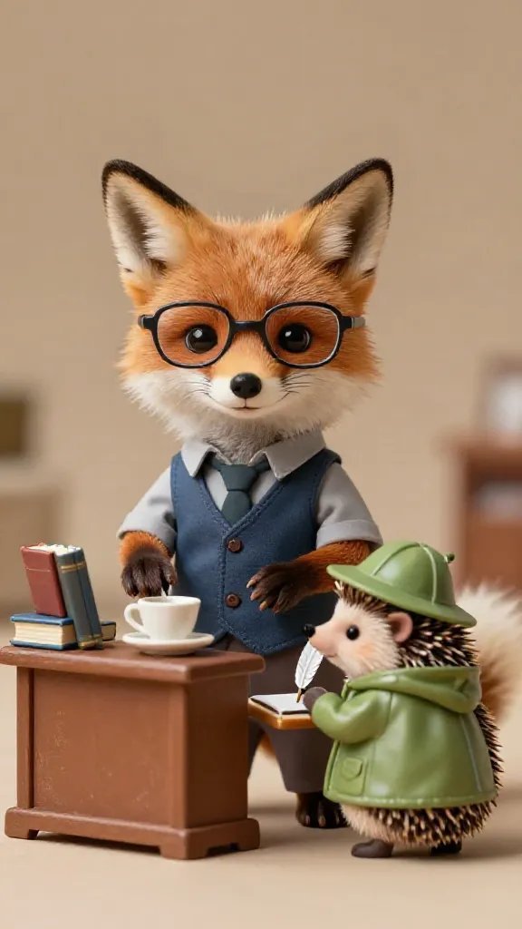
Animal characters dressed in human clothes or performing human tasks add humor and relatability. Kids love recognizing animals in funny roles that hint at the story’s humor.
Details to consider:
- Expressive animal faces and props
- Playful color choices that suggest personality
- Simple backgrounds that keep focus on the critters
Note: Use believable animal features to keep it charming rather than surreal. The goal is warmth, not confusion.
9. Bold Minimalism with a Spark of Wonder

Simplify to amplify. A single striking shape or motif with ample negative space can be incredibly compelling and easy for kids to recognize from afar.
Elements to include:
- One central icon (a key, a ship, a crown)
- Limited color palette with high contrast
- Clean, readable title placement
Why this works: It’s bold, modern, and instantly legible on a crowded shelf. Seriously, sometimes less is more for a kid’s first impression.
10. Interactive Die-Cut or Textured Cover Elements
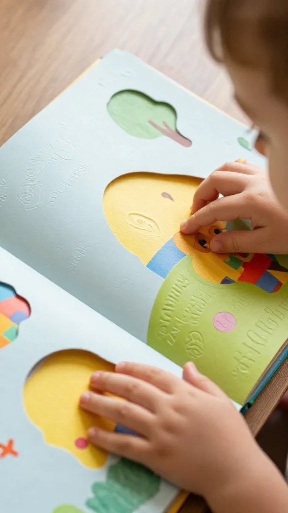
Have a cover that begs to be touched. Die-cut shapes, embossed details, or texture patches invite sensory exploration and make the book feel special before it’s opened.
What to plan:
- Strategic cutouts that reveal color or illustration beneath
- Raised textures for hands-on appeal
- Coordinated palette that matches the interior art
Benefit: It creates a tactile memory—the cover becomes a small, tangible adventure in itself.
11. Collage-Inspired Scene with Mixed Materials
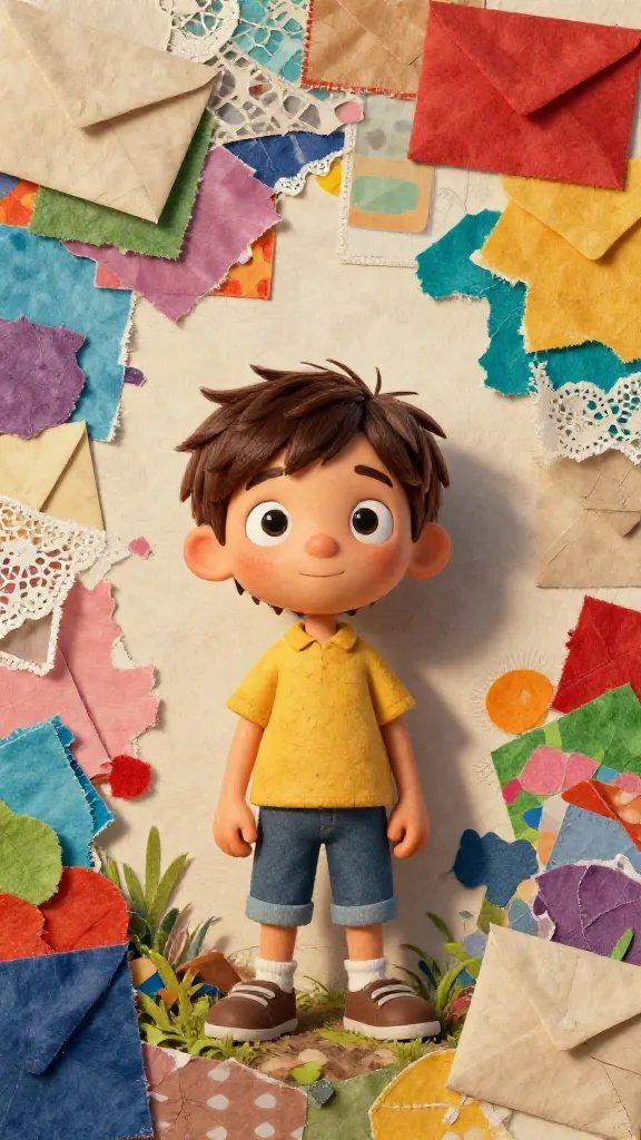
Collage art feels adventurous and crafty, like a handmade invitation to read. Layer papers, fabrics, and found textures to build a lively, curious world.
How to execute:
- Mix irregular shapes and patterns
- Use scraps of color that echo the story’s themes
- Keep characters clear amid the textures for legibility
Final thought: This approach invites kids to ask, “How did they make this?” and to anticipate a playful, hands-on reading experience.
Ready to pick a direction? IMO, pairing a strong character moment with a bold color choice tends to grab kids the fastest, while hidden clues keep parents curious too. Trust me, your next book cover idea can feel like a wink and a promise all at once.
So, which cover idea will you try first? Start with a quick sketch, test it with a kid or two, and watch the curiosity spark. You’ve got this, and your pages will thank you.